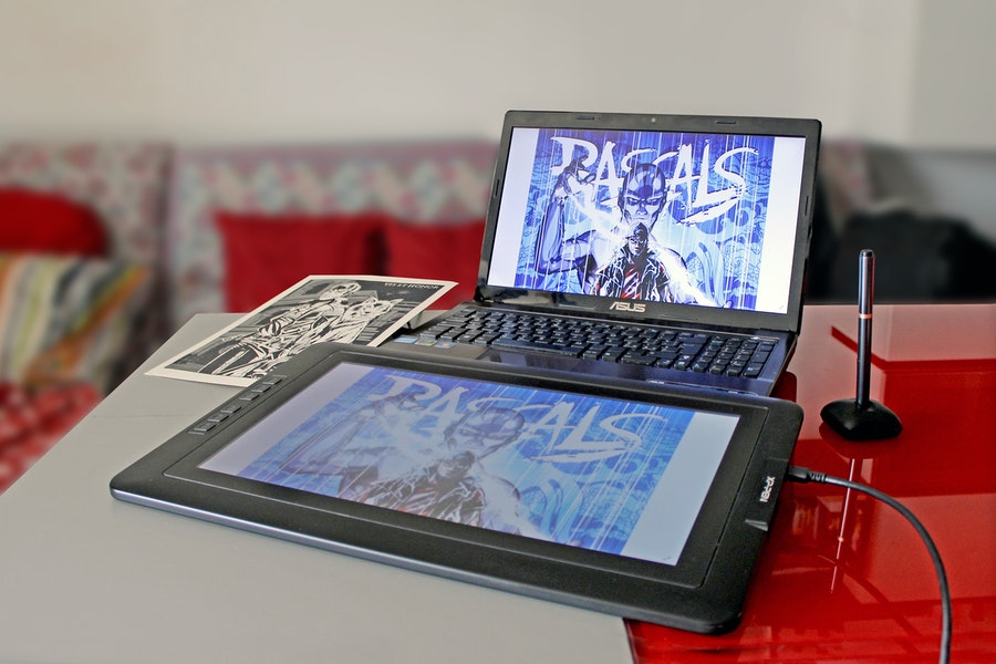
There are two important things to consider when starting out in digital art: The actual tools and things you will need to create art digitally, and the actual basics of drawing. Other articles featured on this site cover necessary tools in greater detail, and this article is primarily concerned with telling you about how to draw. Shading, coloring, pens, and other things all provide a huge amount of flexibility in how you can create art digitally, and while this can be intimidating, this article should provide a useful foundation for these topics.
Getting Started
Getting started in digital art can be intimidating, but this article is aimed at breaking up a behemoth of information into something hopefully much more digestible. Tools, shading, and learning the basics of coloring are all of course very important, but more than that, one of the most important things you can do when starting off is to practice. Experiment with brushes, pen weight, and pressure to find out what works for you and your art best. Try out anything you want to! Nobody can judge the ways you make art, or the art you make, so just try whatever you want. No matter if it works or not, experimenting is -practicing, and practice is essential to becoming an artist and familiarizing yourself with digital art.
As well as experimenting with what feels most comfortable for you, there are things you can do to make your journey much easier! Memorizing common keyboard shortcuts for your drawing program of choice can be very useful. Another common bit of advice is to get a drawing tablet. While they can be expensive, cheaper ones are available, and they provide a lot of functionality and make drawing digitally much more natural. Another thing to remember is that digital art is going to feel strange at first, no matter how experienced of an on-paper artist you may be. The only way to overcome this is with use and time.
Tools
Covering the full extent of tools available to you as a digital artist is past the scope of this article, but it’s still important to consider the things you may need as a digital artist. Other articles on this site cover this topic in far more detail than is found here. You will, of course, need a computer ton draw digitally, and you’ll need to make sure it has the processing power required to run a drawing software, as well as the storage necessary to hold any art you might create. Getting a tablet can, as stated above, make art feel more natural, but ultimately, all you’ll need is a decent computer and dedication.
Other tools are more digital in nature-Pen packs, access to articles like this one that cover important topics, and tutorials on how to use different drawing programs. But like with physical tools, these all come secondary to your own experimentation and willingness to learn. With this in mind, your journey into digital art should hopefully be easy and fun!
Brushes
The sheer number of brushes offered by most drawing programs can be overwhelming for any beginner, but it’s important to keep in mind that you only need to start small, and can scale up to suit your needs as you go. Hundreds of brushes are offered to mimic brushes, markers, watercolor, and any other medium that a more traditional artist might want to use, but the vast majority of artists really only use a few brushes. The most commonly used brush is the standard round brush, which is exactly was it sounds like-a standard, circular brush. This brush can offer a huge amount of flexibility just by editing the different settings.
Basic Settings to Remember
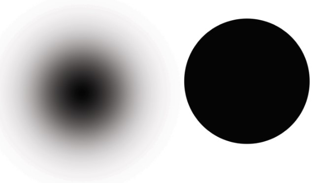
Important settings to remember include brush size, which is self-explanatory, and brush hardness, which controls how blurry or crisp the edges of a brush is. A brush at 100% hardness will have crisp edges, while a brush with 0% hardness will have feathered edges.
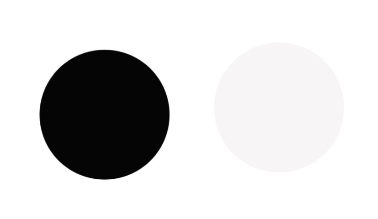
Opacity is controls how visible, or opaque a brush is, with 100% being completely opaque, and 0% being totally translucent. Opacity controls the amount of color put down with each stroke regardless of any other setting that may affect this as well.
Spacing controls the distance between brush marks in a stroke, and editing this setting can be useful for making patterns, but is far less useful for things like sketching.
Blending Modes
Blending Modes control how the added pixels interact with others on the same layer. They directly affect the palette of a layer, and blending modes cannot be edited after painting on a layer. Blending modes also offer the “Behind” and “Clear” options, making it easy to control whether or not you can paint over objects on the same layer, or can just paint in empty space.
Flow and Airbrush Settings
The Flow setting controls how much color is applied to an area with every stroke. It works a bit like opacity, except for the color can be built up as more and more strokes are applied to an area. The airbrush setting works a bit like flow, except for the color is built up as the brush stays in one place, instead of with multiple passes over one area.
Pen Pressure
Another important setting, especially for art tablet users, is pen pressure. Pen pressure is a setting available to most drawing programs on the market currently, and can be used to control both opacity and stroke size. Pen pressure makes it so that using a tablet more closely mimics paper, and the lighter your pressure, the smaller and more translucent your stroke will be, while more pressure increases sensitivity and makes your stroke thicker. If brush pressure isn’t already turned on, you can find it in the brushes menu.
Coloring
One of the most important parts of creating art is ensuring you’re working with colors that are eye-catching and visually appealing, while also ensuring that you aren’t overwhelming or causing eyestrain to your audience. Another, equally important aspect, is ensuring that you’re using the right color mode (CMYK or RGB) for whatever your art is going to be used for. While color theory is far outside the reach of this article, we can still discuss various color palettes, as well as which color system to use here.
CMYK or RGB
CMYK and RGB are the two most commonly used systems for digitally creating color. RGB stands for Red, Green, and Blue, and is used by all displays, which use a combination of LEDs to create these colors. RGB is the color mode you should use when making art for digital use, that will be seen on screens of any variety. CMYK is the color mode used by printers, and stands for Cyan, Magenta, Yellow, and Black, and they add various dyes together to create different colors. CMYK is the color mode you should use for printing.
Color Schemes
There are three kinds of color schemes that will be discussed in this article: Monochromatic, analogous, and complementary. Monochrome palettes are palettes consisting only of hues of one color, and are easy enough to create and provide a cohesive and coherent look. Analogous color schemes are created by choosing a color, then selecting its left and right neighbors on the color wheel. Analogous schemes are visually pleasing and easy on the eye. Complementary color schemes are created by using two colors opposite each other on the color wheel, and can provide great contrast for any design.
Shading
Another just as important aspect of art is shading. There are thousands of other tutorials that go more in-depth online, but we can still cover the basics here. While you’re probably familiar with how shadows interact with the world from living in it in the past years of your life, it’s still important to practice shading. More complex objects, as well as overlapping objects, can create complex issues when trying to shade.
Light Source
One of the most important parts of shading is figuring out where your light is coming from. When shading, make sure to keep this in mind, as well as the intensity of the light, and how it will interact with your subject. A warm, soft light will illuminate something very differently from an intense white light will. Light distance can also affect shadows, and their crispness-A closer, or more intense light source will create a more defined terminator (or the edge between shadow and light), while a soft or far away light will create a fuzzier terminator line.
Occlusion
Shadows are visible because of the light that objects reflect. While this light is going to be dimmer than other lighting, its why shadows are gray instead of being pitch black. Object occlusion is created when the light reflected off of an object can’t reach a place, like the edges of where two objects are touching, or a dark corner.
Kinds of Shading
There are two ways of tackling shading that we will cover in this article-Cel shading and soft shading.
Cel shading is a more cartoon-y style of shading that involves just coloring shades over your subject where shadows should lie. It’s less realistic shading, but it helps to provide a sense of three-dimensionality to subjects. This style of shading is often used to mimic comic book or cartoon characters and styles.
Soft shading is a more complex and time-intensive version of shading that creates a soft and smooth transition between base colors, lights, and darks. It involves much more smudging and highlights, and is a more realistic method of shading.
What kind of shading you use depends on preference and art style!
Shadow Color and Highlights
When comparing shadows in the real world, you’ll notice that they can vary in color depending on what is casting them. The color in shadows is a mix of the color of whatever is blocking the light, as well as reflected light from other objects. Most shadows are going to be gray, but it is still important to keep this in mind. As well as this, the color of the lighting can affect how a shadow is cast and its color-Warm lighting, like the sun, creates different color than the cool lighting of fluorescent lights.
Highlighting is an important part of shading, but is also its antithesis. Highlights are used to create a sense of where light is reflected off of something, and can be created by either applying white to your drawing, or by picking the surrounding color, lightening it slightly, and then applying it in the area you want to be highlighted. I recommend you use a soft edge brush instead of a hard brush if you want the highlight to look more natural.
File format
Another important question when making digital art is what file type to use when saving your art. Different formats need to be used for different purposes, and we’ll cover four file types here: PSD, TIFF, JPEG, and PNG.
PSD
A PSD (Photoshop Design) can be a useful file if you’re working with Photoshop, or if you’re working with a team of people who all have access to Photoshop. PSD’s save all the layer information for an image, allowing them to be opened in Photoshop and edited from where you left off editing them.
TIFF
TIFF’s (Tagged Image File Format) are the most useful file for storing digital art, as they are lossless files and retain the quality of your art. They pay the price in functionality with being significantly larger than JPEG’s and PNG’s, but can be converted to both and can be handy in making sure your art is of high quality.
JPEG
JPEG files are good files to use for web-based art. They are universally supported, and are a good-sized file if you’re short on space. They don’t support transparency.
PNG
PNG files are higher quality and good for printing. They can take up more space, but they aren’t as sizable as TIFF’s and support transparency.
While all of this can be important to cover and study, at the end of the day, the most important part of learning digital art is to practice drawing. Familiarize yourself with the different aspects of it, tackle a little at a time, and with time and dedication your skills as an artist will grow.